 KA Hearth
A small blog where Matthias posted thoughts on things happening around Khan Academy. (Archived) About Me
KA is more blue
KA just updated program pages to change the user nickname, the highlight on the selected tab, and the based on link of programs to be blue, instead of green like most elements on the CS pages.
Aside from looking objectively worse, as a result of mixing the blue with the green still common on page, this change also breaks two things. First, it removes an element that the KA Extension locked onto in order to fill in extra program info. This is to be expected with an any KA change; the KA Extension is definitely hack-y and is not supported. But the second thing that broke is hovering over profiles on program pages. This used to bring up the card with user profile info (which still comes up if looking at a comment). I wouldn’t be surprised, if, in the future, we saw this trend continue. A minor change to KA removes a relatively minor feature from the CS side of the website.
It remains to be seen if KA will continue blue-ifying areas of their website until their theme color is just blue, or if there will be a limit to this spread.
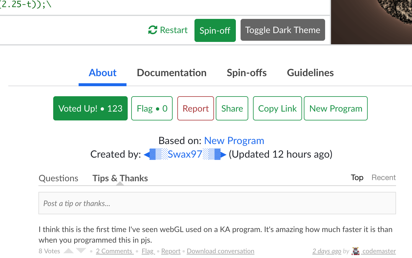 Screenshot of the new colors (with the KA Extension, of course)
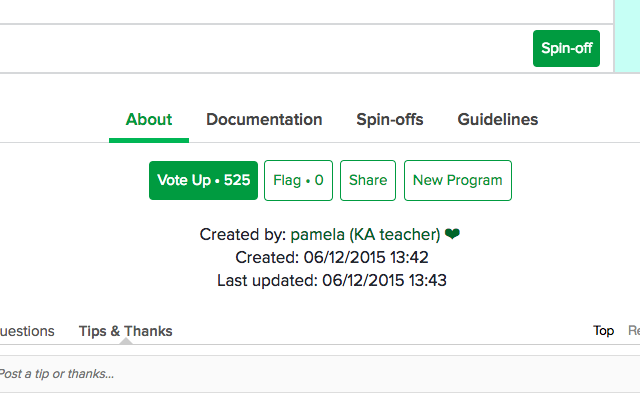 Screenshot of the old colors provided courtesy of Jett (with a slightly older version of the KA Extension, of course).